.breakdance .bde-div-413-101{background-image:url(https://papermaker.ai/wp-content/uploads/2023/11/pexels-google-deepmind-17483867-2-1024×576.jpg);background-size:100% auto;background-repeat:no-repeat;background-position:45.54% 59.87%}
10
Minute Read
What does XUI mean and how does it differ from UI?
“Explainable User Interfaces” (XUIs) have emerged as a critical component related to “Explainable Artificial Intelligence” (XAI), addressing the growing complexity and opaqueness of machine learning (ML) models [1]. Before diving deeper into the field of XUI it’s necessary to distinguish it from the closely related term “User Interface” (UI). Although UIs are a central object of study within Human-Computer-Interactions, there is no universally agreed-upon definition. In general, a UI can be described as something that connects a computational device, a human user, and a set of objects that are intentionally dealt with within a process [2]. In contrast, Chromik and Butz define XUI as the “sum of outputs of an XAI system that the user can directly interact with” [3]. Therefore, one can subsume that an XUI is an object generated by an XAI system which is displayed on a UI. Taking all these aspects into account, our research team has derived the following definition for the term XUI, which is described as an
“interface that presents the explanation generated by XAI techniques in a user-friendly, adaptive and interactive manner to enhance model understanding.“
It is important to note, that not every XAI method includes XUI to deliver generated explanations to non-expert users in an intuitive and easily understandable way. Many XAI methods are algorithms without user-friendly visualizations. The table below contains some common XAI methods. It indicates which XAI methods incorporate XUI and which do not.
table {
font-family: arial, sans-serif;
border-collapse: collapse;
width: 100%;
}
td, th {
border: 1px solid #000000;
text-align: left;
padding: 8px;
}
tr:nth-child(even) {
background-color: #dddddd;
}
XAI Method Includes XUI? Local Interpretable Model-agnostic Explanations (LIME) Yes Shapley Additive Explanations (SHAP) Yes Partial Dependence Plots (PDP) Yes Accumulated Local Effects Plots (ALE) Yes Anchors No Counterfactual Explanations No Contrastive Explanations No Saliency Maps Yes Linear/ logistic regression (interpretable by design) Yes Decision Trees No
Table 1: Overview of common XAI methods providing information about XUI implementation [4][5][6]
Visualization methods
During our research, we have come across various visualization methods, as shown in Figure 1. Diagrams are frequently used because they are well-suited for showing relationships in extensive datasets. Specifically, in conjunction with deep neural networks, XAI methods utilize tornado diagrams to display the importance values of significant features. These diagrams are suitable for this use case because the features are sorted vertically in a horizontal bar chart, beginning from the top with the most important feature. They increase the understanding of feature importance. For instance, both Lime and SHAP are proficient in generating these diagrams and offer token and word highlighting. Additionally, as indicated in Figure 1, Saliency Maps are employed to generate heatmaps, which can highlight crucial pixels, particularly in image classifications.
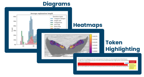
Figure 1: Common visualization techniques for XUI
Since the field of XUI is still young and lacks universal standards and definitions, we will further showcase two specific XUI solutions that research groups came up with. The first publication introduces Fake Articles Classification and Decision Explanation and the second one covers Explainable Hate Speech Detection.
Facade: Fake Articles Classification And Decision Explanation
In “Facade: Fake Articles Classification And Decision Explanation”, the authors created a software, serving as a fake news detection system. They applied XAI & XUI methods to their implementation to examine and classify news articles. Users have the option to input a link to a newspaper article or upload a PDF file. After uploading, the system extracts both textual and meta-information to derive various features. These features encompass aspects such as grammatical errors, parts of speech, term frequencies, as well as sentiment, entailment, attribution, and syntactical structure. Depending on this analysis, the article is categorized as either “FAKE” or “REAL”. Additionally, users are provided with a confidence score about the classification result [7].

Figure 2: User Interface of the FACADE-software, in the style of the newspaper “The Daily Prophet” from Harry Potter.
In Figure 2 the UI of FACADE is displayed. The XUI consists of the following components/objects:

The article was classified as “Fake”. Next to it are interactive buttons with which the user can activate contribution highlighting. The confidence score displays the level of confidence about the classification made by the AI.

The intensity of the red color corresponds to the level of influence these tokens or words have on the classification. In other words, the darker the color tone, the stronger the contribution of these tokens or words to the classification decision. This color tone is determined by assessing the similarity score between the sentence in the article and the corresponding information from the attributed source stored in the database. Users also have the option to highlight sentences which contribute to the “Real” classification. However, unlike the red highlighting used for “Fake” contributions, these sentences are highlighted in green color.
When users hover their cursor over highlighted sentences, additional information is displayed, revealing the attributed source from the database. This information includes the website title (such as “Mission of…”), the source (e.g., sputniknews.com), and the specific sentence from the article that is referenced by the source. This feature provides users with context and allows them to see where the information supporting the classification decision originates from.
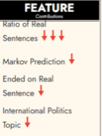
The number of arrows serves as a signal of how much each feature contributes to the classification result. The direction and color of the arrows are used to represent the nature of the contribution: For “Real” contributions, the arrows are green and point upwards, indicating that these features support the classification as “Real.” For “Fake” contributions, the arrows are red and point downwards, signifying that these features contribute to the classification as “Fake.” This visual representation of feature contributions helps users understand which aspects of the article played a significant role in its classification as either “Real” or “Fake.”
Additionally, the authors implemented the Explainer Dashboard tool. This is a dashboard which shows the inner workings of blackbox machine learning models by providing many XAI methods such as SHAP and PDPs [8].
Design Principles for User Interfaces in AI-Based Decision Support Systems: The Case of Explainable Hate Speech Detection
The second paper incorporating XUI is titled “Design Principles for User Interfaces in AI-Based Decision Support Systems: The Case of Explainable Hate Speech Detection“ [9]. In this paper, the authors developed fundamental design principles (DP) intended to assist moderators on social media platforms in identifying hate speech. Their objective was to create a user interface that aligns with these established DPs. After undergoing three rounds of evaluation and design refinement, the researchers successfully developed the UI showcased in Figure 3.
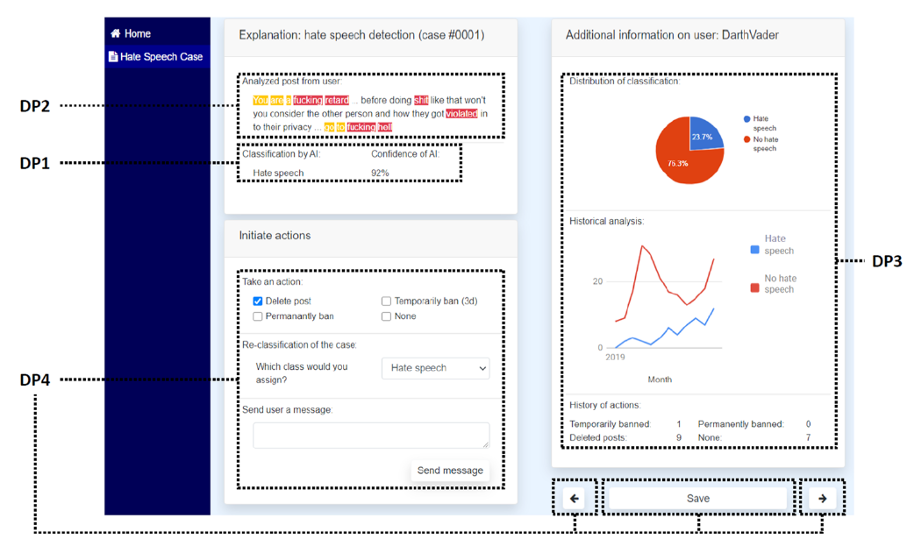
Figure 3: UI for a case-based decision program for social-media moderators
The following design principles are reflected in the UI design:
The unstructured text is classified as either hate speech or not through an AI-based classification process. The AI system analyzes the text, looking for patterns, linguistic cues, and other indicators that are associated with hate speech. Based on its analysis, it classifies the post as hate-speech or not. Additionally, the AI system provides a confidence score along with its classification decision. This confidence score indicates the level of certainty or confidence that the AI has in its classification.
The XAI system thoroughly examines the user’s post and identifies noteworthy words or tokens. These significant elements are highlighted using distinct colors and are presented through the XUI. This approach is designed to enhance transparency for the user, clearly illustrating how specific words or tokens played a role in influencing the classification decision.
In the designated column, the user interface displays case-based context information regarding the user’s prior behavior. This information includes details about the user’s previous actions, interactions, or conduct on the platform or within the system.
Moderators have the choice to take immediate actions when hate speech is detected. Upon identifying hate speech through the system’s classification and analysis, moderators are empowered to directly intervene and initiate actions to address the situation.
Conclusions
In summary, XUI are important components of XAI enhancing the transparency of complex machine learning models. Unlike UIs, which represent all objects on the screen, XUIs specifically present the outputs generated by the XAI method. These interfaces are essential for making AI models understandable to users. We found that not all XAI methods incorporate XUIs, and many lack user-friendly visualizations. However, two projects, “Facade” and “Design Principles for User Interfaces,” demonstrate the practical application of XUIs. In essence, XUIs make AI more accessible and transparent, ensuring users can interact confidently with AI systems while fostering responsible decision-making in various contexts.
Learn More About XUI
If you’re interested in delving deeper into XUI, here are some resources to explore further. These articles, research papers, and tools can help you expand your knowledge of this exciting field. You may also be more interested in the AI Paper Maker- project. In this case read more about the project here.
Sources
[1] Alejandro Barredo Arrieta u. a., „Explainable Artificial Intelligence (XAI): Concepts, Taxonomies, Opportunities and Challenges toward Responsible AI“, Information Fusion 58 (1. Juni 2020): 82–115, https://doi.org/10.1016/j.inffus.2019.12.012.
[2] Leonel , V, Morales Diaz (2022). „What is a User Interface, again? A Survey of Definitions of User Interface”, https://doi.org/10.1145/3565494.3565504
[3] Michael Chromik and Andreas Butz. 2021. Human-XAI Interaction: A Review and Design Principles for Explanation User Interfaces. In Human-Computer Interaction – INTERACT 2021: 18th IFIP TC 13 International Conference, Bari, Italy, August 30 – September 3, 2021, Proceedings, Part II. Springer-Verlag, Berlin, Heidelberg, 619–640. https://doi.org/10.1007/978-3-030-85616-8_36
[4] A. Holzinger et al. (Eds.): xxAI 2020, LNAI 13200, pp. 13–38, 2022. https://doi.org/10.1007/978-3-031-04083-2_2
[5] Molnar, C. (2022). Interpretable Machine Learning: A Guide for Making Black Box Models Explainable (2nd ed.).christophm.github.io/interpretable-ml-book/
[6] A. Holzinger et al. (Eds.): xxAI 2020, LNAI 13200, pp. 255–269, 2022. https://doi.org/10.1007/978-3-031-04083-2_13
[7] https://ceur-ws.org/Vol-3277/paper4.pdf
[8] https://github.com/oegedijk/explainerdashboard
[9] Meske, C., Bunde, E. Design Principles for User Interfaces in AI-Based Decision Support Systems: The Case of Explainable Hate Speech Detection. Inf Syst Front 25, 743–773 (2023). https://doi.org/10.1007/s10796-021-10234-5
